Cape
A clearer way to work with AI.
At Cape I was both the designer and the lead frontend engineer. The job was to bring a chat assistant, data-heavy dashboards and document review into one workspace that felt like a single product.
- My role
- Designer & Lead Frontend Engineer
- Focus
- Product design & frontend engineering
- Product
- AI-powered workspace
- Interfaces
- Assistant, dashboards & review tools
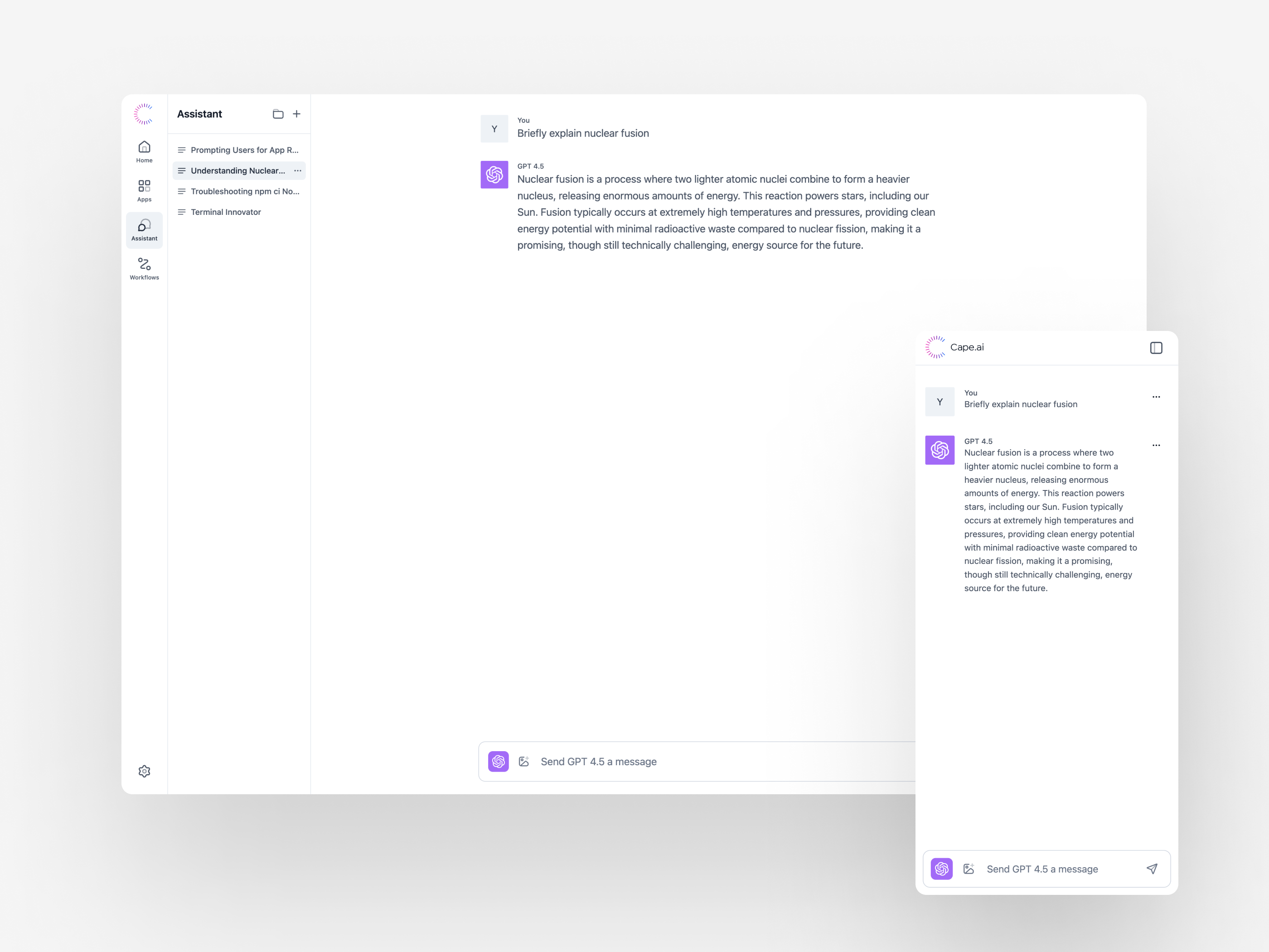
I worked on both the design and the frontend. A chat thread, a customer dashboard and a document review look very different, but they had the same design problem: people need to know where they are, what they’re looking at and what they can do next.
The same conversation, in two sizes.
The screenshot shows the assistant as a full page and as a narrow side panel. The full page has room for history and navigation. The panel drops those and leads with the conversation and the message box. Both keep the model label, the same message layout and the same place to type a reply.
Part of the product.
Assistant sits in the main rail next to Apps and Workflows, and a second column holds past conversations.
A readable exchange.
Sender and model labels separate the prompt from the response without getting in the way of the text.
A narrower version.
The side panel keeps the conversation in a much narrower space, with the message box fixed below it.
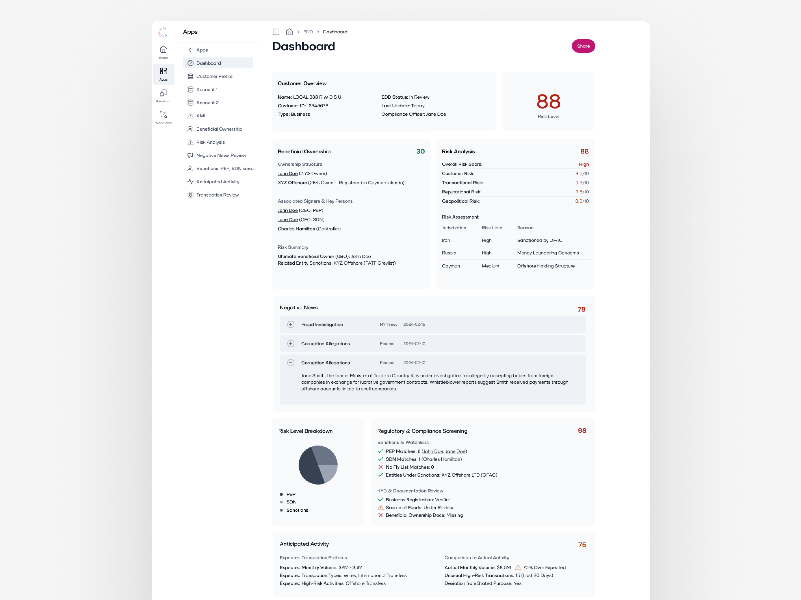
A useful overview, with the detail close by.
The dashboard puts customer context, ownership, risk categories and review information on one page. The summary sits at the top where it’s easy to find, and grouped sections with expandable rows hold the detail underneath.
Summary before detail.
The customer overview and the headline risk indicator come first, before the denser review sections.
Sections keep their shape.
Ownership, news, and individual risk categories retain their own headings and visual boundaries.
Rows that open.
News items stay compact until you expand one to read the detail.
Keep the source in sight.
The review workspace puts a document next to a list of control objectives, so a reviewer can keep the source open while working down the list. Each review state has its own marker.
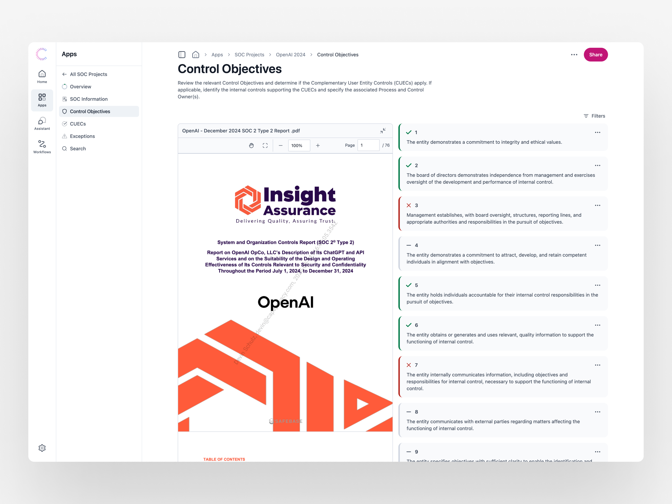
Side by side.
The document and the review list each get their own pane in the same view.
Shape as well as color.
Checkmarks, crosses and neutral marks show each state, so color is never the only signal.
Tools near the work.
Page navigation and zoom sit with the document; filters and item menus sit with the review list.
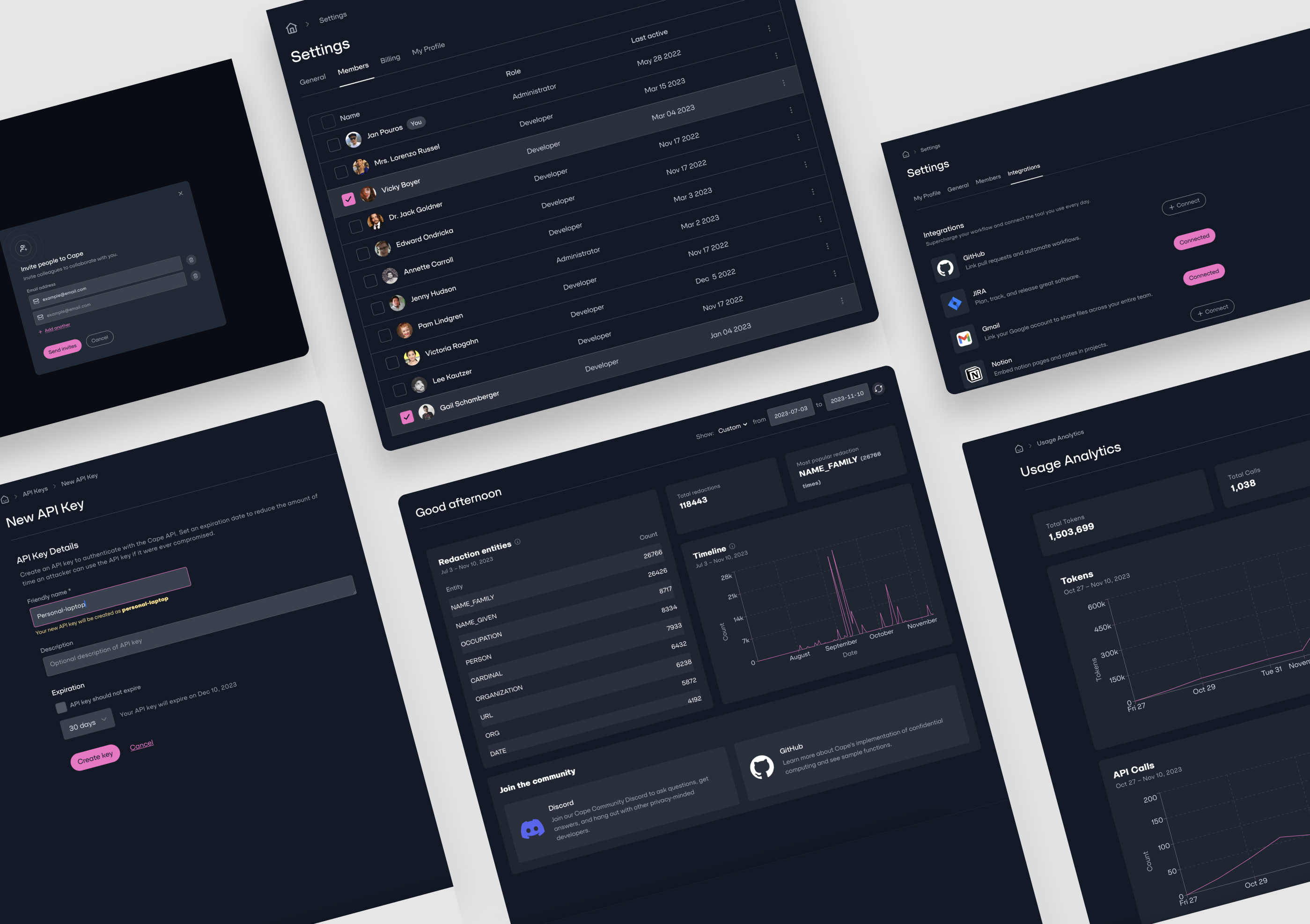
The settings around the work.
People open team management, integrations, API keys and usage reports less often than the assistant or the dashboard, but the same rules apply: say what state something is in, say what an action will do before it happens, and never show a number without the date range it covers.
Status first.
A connected integration shows its status. Only the integrations that aren’t set up yet offer a way to connect.
Say what will happen.
While you fill in the API key form, it shows the name of the key it will create and the date it expires.
Numbers with dates.
Redaction totals and usage figures always show the date range they cover.
Designing it and building it.
As the designer and the frontend lead, I worked on how the interface looked and how it was built. Doing both meant the reasons behind a design carried through into the code.
The hard part was deciding what deserved attention, what could sit a click away, and how to keep people oriented as the task changed.
- Orientation
- Help people see where they are, whether that’s in a conversation, an app or a document.
- Continuity
- Keep familiar patterns in place when the screen gets smaller or the task changes.
- Reviewability
- Keep the information behind a summary or a decision within reach, so people can check it.
What the screens have in common.
Looking back, these screens are mostly about context. An assistant needs a readable conversation, a dashboard needs a clear hierarchy, and a review tool needs room for the source document. The frontend is where that turns into something people can use.
Product screenshots from Cape. This case study covers my part: designing the interfaces and leading the frontend work.